Cassandre
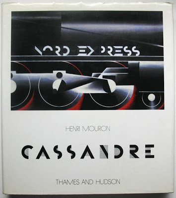 I was lucky enough back in London to find this book about the life and work of A.M. Cassandre in a second hand shop, I didn't hesitate to quickly snap it up and couldn't believe my luck in finding it!
It is actually my dad who introduced me to Cassandre and we both love his work and graphic style. Cassandre's work is instantly recognisable and typified by bold graphic imagery, strong geometric forms and use of typography. Along with designing for theatre and creating typefaces, Cassandre is probably best known for his poster designs and commercial advertisements produced during the 1920's and 1930's. Here he cleverly integrated 'experimental' artforms, in particularly cubism, into his mainstream commercial designs.
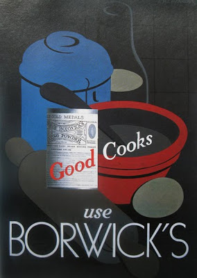
Below: 'Borwick's' 1935 (gouache)
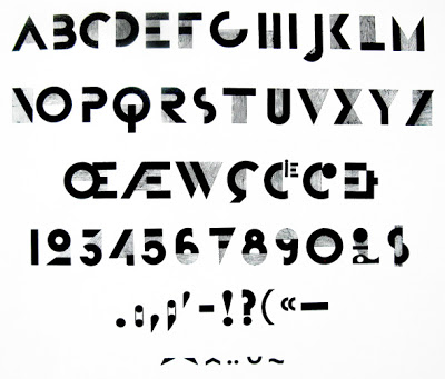 The typeface 'Bifur' designed by Cassandre in 1927; simplified geometric characters and the elimination of any solid horizontal or vertical lines that were not completely necessary, filling the left spaces with thin parallel lines.
 It was Cassandre who was responsible for the famous logo and typeface for Yves Saint Laurent back in 1963.
Below 'Nord Express' 1927 (oil on wood)
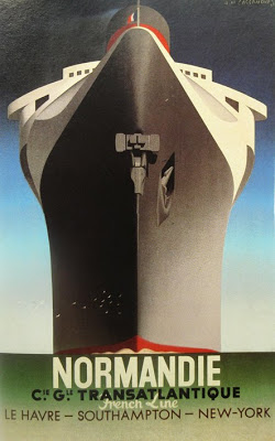
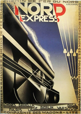
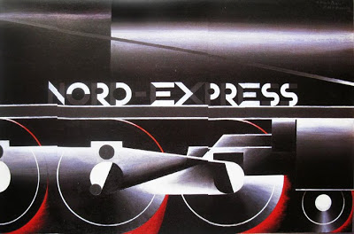 Most people will probably know Cassandre's work from the series of travel posters he designed advertising trains and ships such as the 'Etoile du Nord' and the famous 'Normandie'. These perfectly demonstrate his strong use of geometric forms, integration of text and powerful graphic nature. His clever use of perspective in these posters is a dominating feature, along with simplified colour palette and employment of a lot of black.
Below another design for 'Nord Express' 1927 (lithographic poster)


Unfortunately I think the book is sadly out of print now, so worth checking auction sites or ABE books if you want to get hold of a copy.
