Decorative lettering
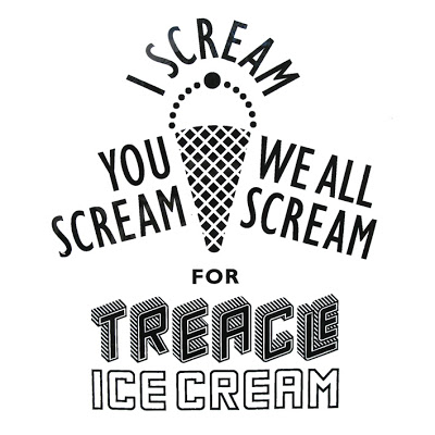
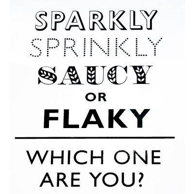
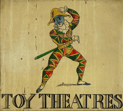
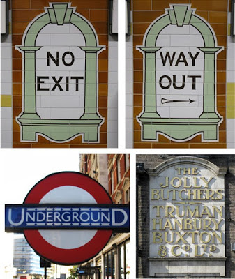 I snapped these pictures of different types of decorative lettering on my recent London visit. I love decoration in any form - and clever use of fonts and typefaces can be extremly eye-catching and decorative in their own right.
 The first two pictures were from posters in the East-End advertising Ice Cream - they caught my eye instantly and I loved the simple but strong graphic elements. The 'Toy Theatres' was from a street sign at Covent Garden (very shakspearean!) and the 'No Exit' and 'Way Out' are from original tiles in the tube station at Covent Garden.
And I couldn't have a feature of decorative lettering from London without the famous Underground logo! It's proper name is 'The Roundel' and its distinctive style and font was designed by Edward Johnston in 1913 - and remains in use to this day.
And I couldn't have a feature of decorative lettering from London without the famous Underground logo! It's proper name is 'The Roundel' and its distinctive style and font was designed by Edward Johnston in 1913 - and remains in use to this day.
Click here to scroll through some great old photo's featuring the London underground and it's iconic logo.
